An imperfect take on
sustainable living

Introduction

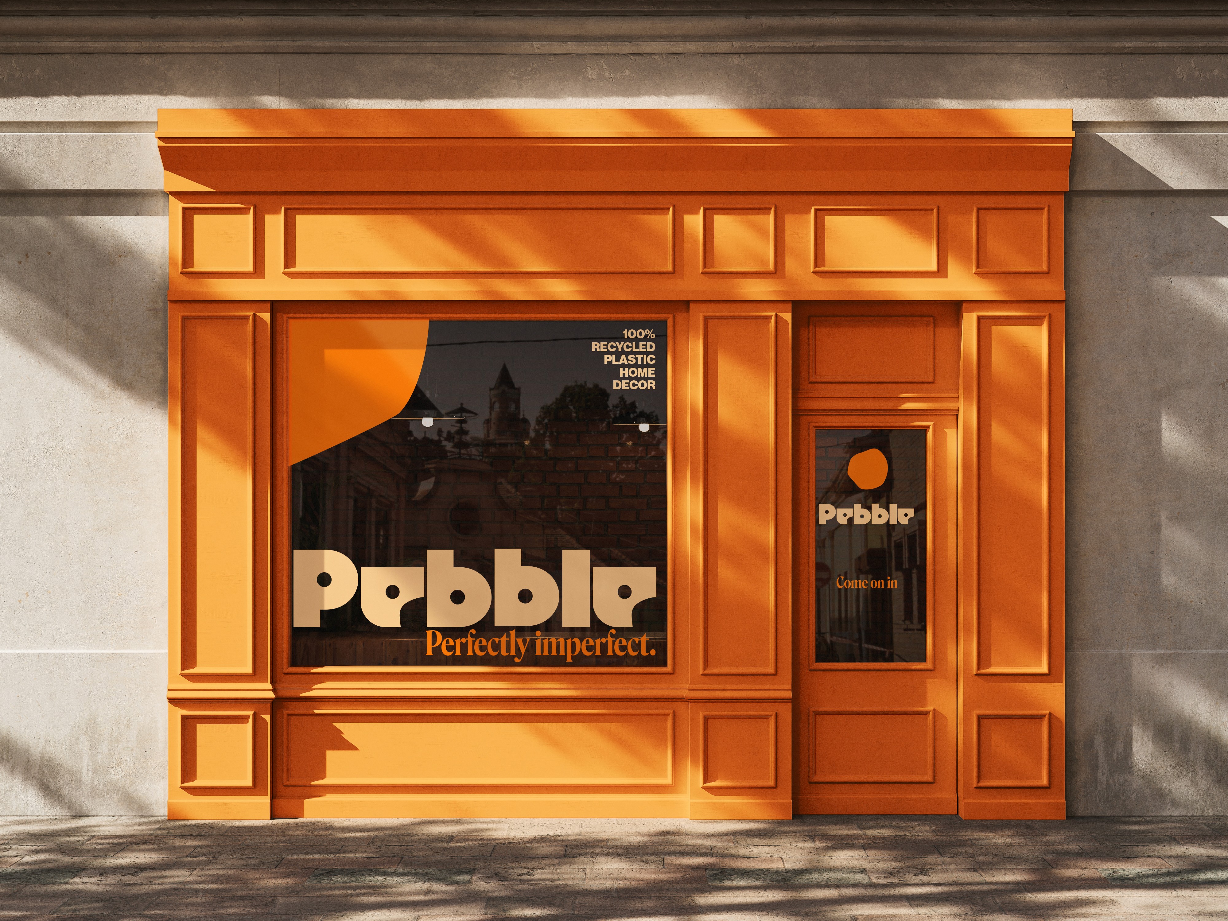
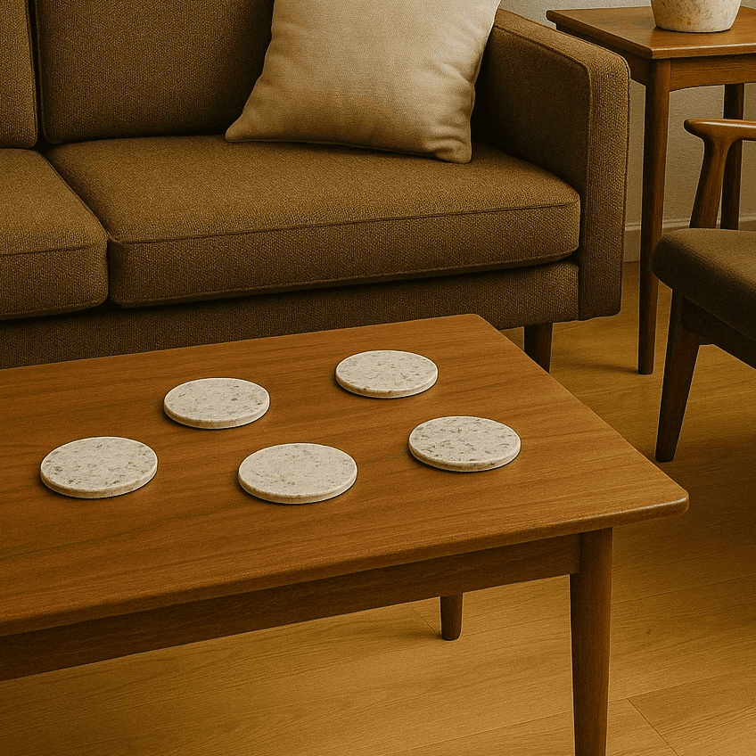
Pebble is a sustainable homeware brand created to challenge the visual conventions of sustainability. During my research, I noticed that many environmentally conscious brands relied on similar visual cues: muted greens, minimalist layouts, and messaging centred around perfection.


While these approaches communicate sustainability effectively, they often feel predictable and disconnected from the reality of recycled materials.

Concept

My concept was to embrace imperfection rather than hide it. I wanted to create a brand that celebrated the inconsistencies, textures, and individuality that naturally emerge through recycled production processes.


This became the foundation of the project and informed every design decision that followed.

The identity began with the logo. Instead of selecting an existing typeface, I developed a custom wordmark inspired by the organic shape of a pebble. The rounded forms, subtle irregularities, and softened edges were designed to feel naturally shaped rather than mechanically constructed.


This allowed the logo to communicate the brand's philosophy before any supporting copy was introduced.

My concept was to embrace imperfection rather than hide it.
I wanted to create a brand that celebrated the inconsistencies, textures, and individuality that naturally emerge through recycled production processes.


This became the foundation of the project and informed every design decision that followed.

The identity began with the logo. Instead of selecting an existing typeface, I developed a custom wordmark inspired by the organic shape of a pebble. The rounded forms, subtle irregularities, and softened edges were designed to feel naturally shaped rather than mechanically constructed.


This allowed the logo to communicate the brand's philosophy before any supporting copy was introduced.

Visual System

Visual System

From there, I expanded the visual language through a system of patterns, typography, colour, and packaging. The patterns were derived directly from the logo forms, creating
a cohesive identity that could be applied consistently across multiple touchpoints.
A bold orange was selected to differentiate Pebble from the expected visual language of sustainable brands and help the brand feel youthful, energetic, and memorable.

From there, I expanded the visual language through a system of patterns, typography, colour, and packaging. The patterns were derived directly from the logo forms, creating a cohesive identity that could be applied consistently across multiple touchpoints.

A bold orange was selected to differentiate Pebble from the expected visual language of sustainable brands and help the brand feel youthful, energetic, and memorable.

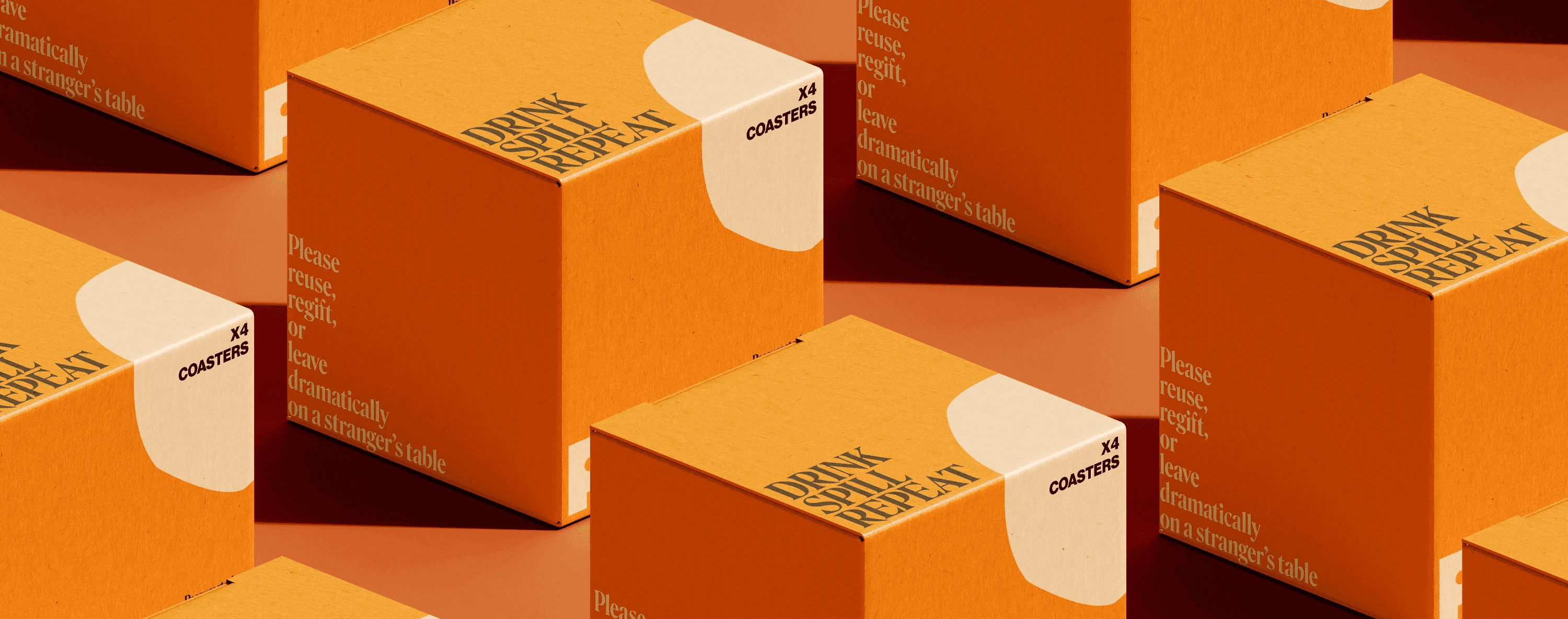
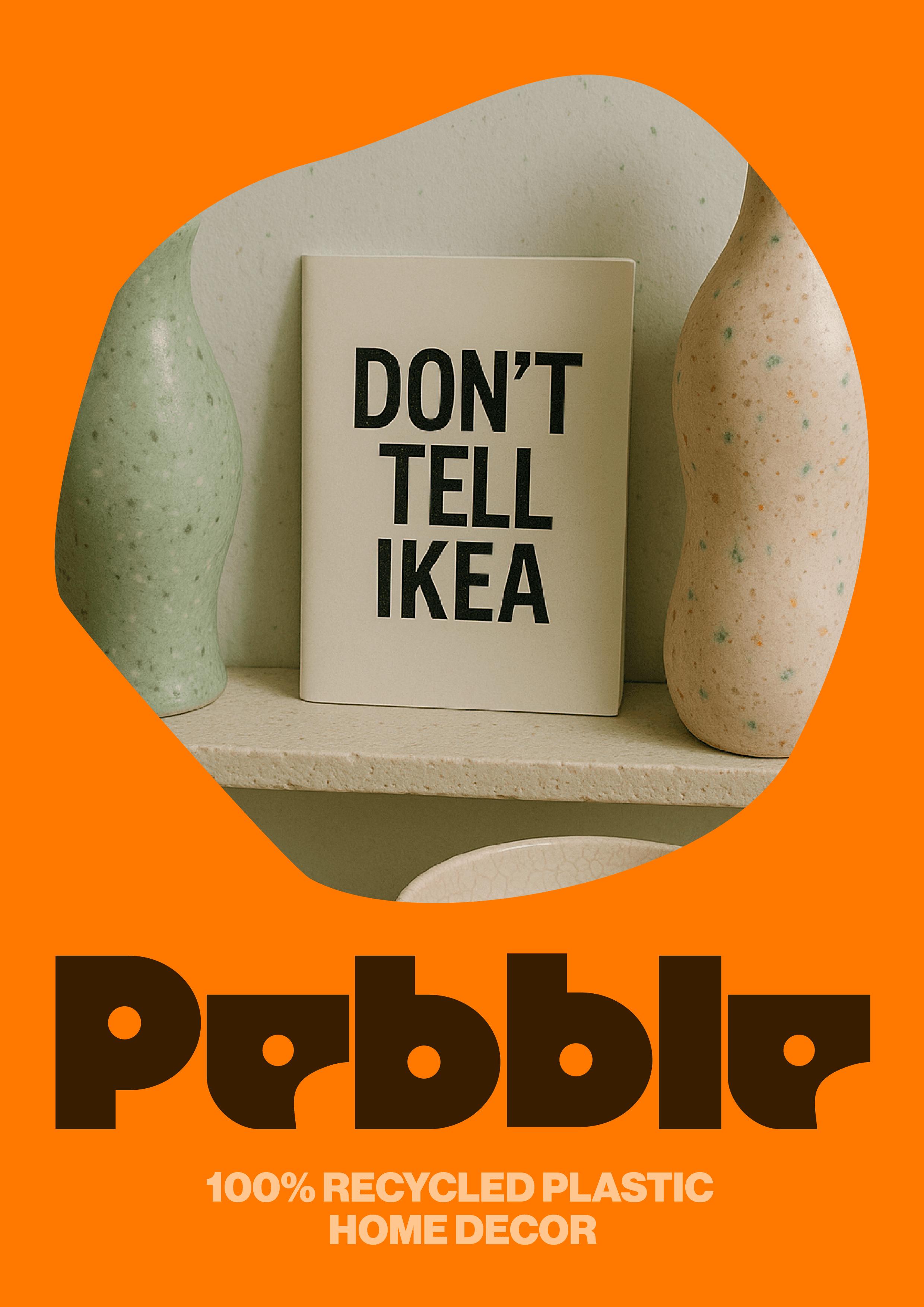
One of the most important decisions was developing a tone of voice that felt human rather than instructional.

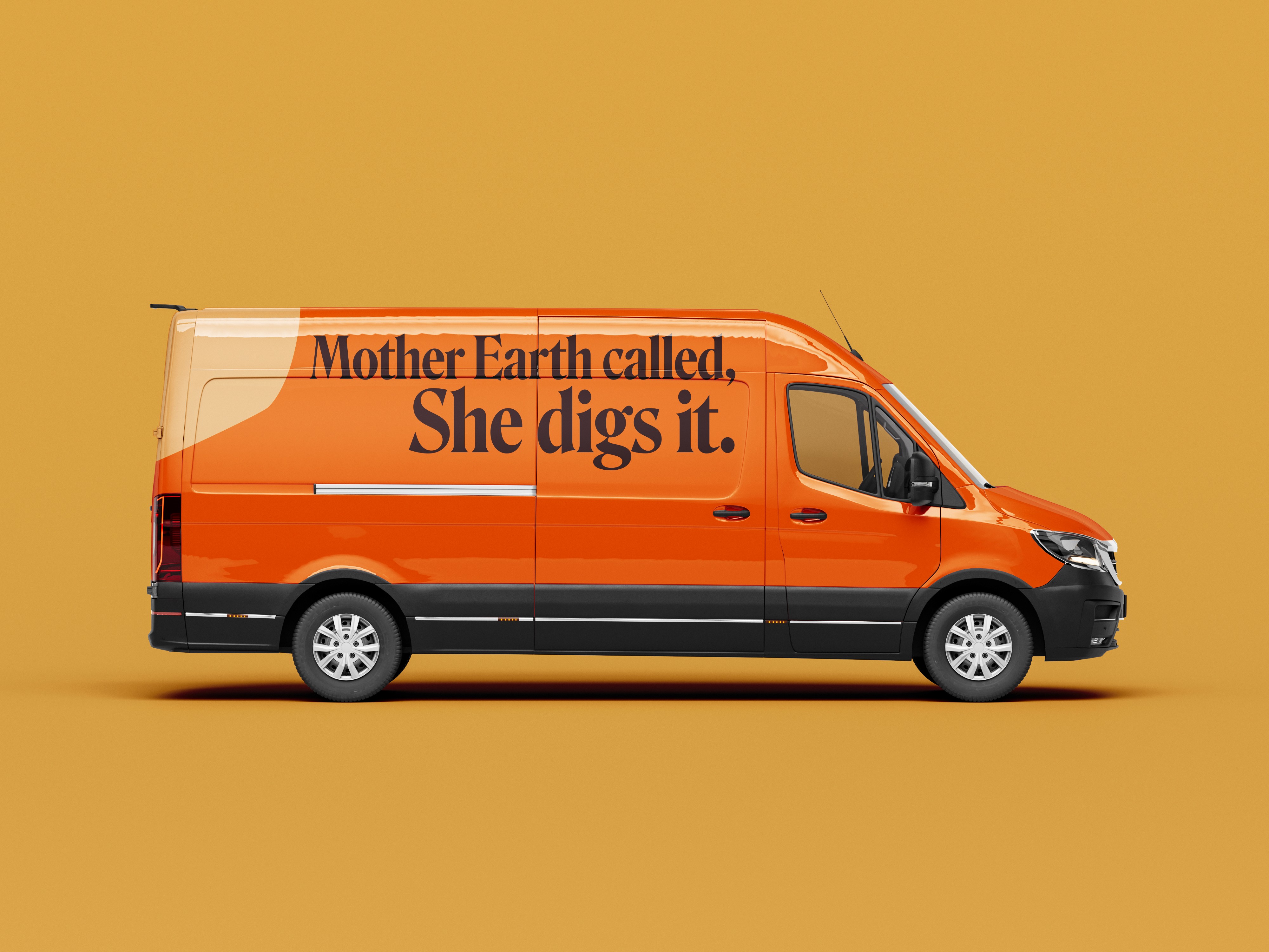
Instead of educating consumers through guilt or environmental statistics, Pebble uses humour and irony to make sustainability feel approachable and engaging.

What I am most proud of is the consistency of the concept throughout the project. Every element, from the custom typography to the packaging and campaign imagery, reinforces the same central idea: sustainability does not need to be perfect to be meaningful.

By embracing imperfection as a strength, Pebble offers a more honest and relatable perspective on sustainable living.

What I am most proud of is the consistency of the concept throughout the project.
Every element, from the custom typography to the packaging and campaign imagery, reinforces the same central idea:
sustainability does not need to be perfect to be meaningful.

By embracing imperfection as a strength, Pebble offers a more honest and relatable perspective on sustainable living.

Applications